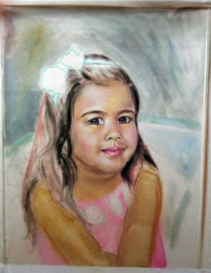
STEP 1
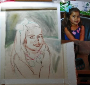
To begin this pastel portrait of a little girl, I transferred my outline drawing to the support (UArt 500 sanded paper). Went over the lines with sepia-toned pastel pencil and sprayed it with fixative so it would hold up as I later started the pastel layers. Blocked in some background with Pan Pastel so I could judge my values as I began painting the subject. I used this reference for the pose and general information, but I did change some things, as you will see later.
STEP 2
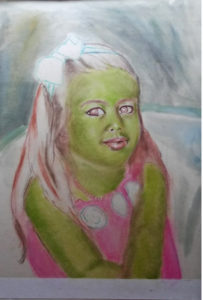
No, Juliet is not a character from “Wicked” with green skin! I saw an amazing artist use the technique of a green undertone for portraits, and I wanted to give it a try.
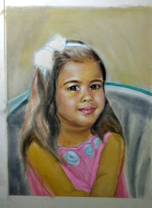
STEP 3
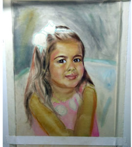
Here I started to block in some general, actual flesh colors with pastel pencils. I felt there were too many disparate, unconnected colors in the photo, so I decided to change Juliet’s dress to pink with turquoise and white trim, for greater color harmony with the dark turquoise chair and the light turquoise bow in her hair, and to bring her forward from the background. I also knew I would be eliminating the distracting window background in the photo and making it simple and abstract. These are the ways that a realistic painter will use a photographic reference as a jumping-off point, but give it an artistic interpretation to bring out the best in the subject, rather than copy every detail in the photo. I feel if you’re going to do just the latter, then why bother? Frame the photo instead!
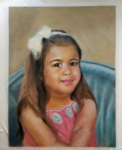
STEP 4
Starting to refine the face and arms a bit more. I did some subtle changes to Juliet’s expression. I know her well, and she is a very feminine, sweet little girl who loves to dress up and pose. I gave her a bit more of a smile and tilted her head up just a bit, to better express her personality. An artist can better do these types of changes if he/she knows, or at least has met, the subject. I felt there was too much area at the top, which made Juliet looke as though she were “falling out” of the painting! 🙂 So I cropped it for better composition.
STEP 5
Started to work out a background color in a mid-tone value (shade) that incorporates a bit of all the other colors in the portrait, which gives a painting color harmony. Also worked on the chair and dress, using Pan Pastel and pastel pencils. I also used some Rembrandt pastel sticks for a few of the colors. If I like what I’ve got and don’t want to lose it, I will give the painting a coat of Spectrafix pastel fixative, which allows me to add additional layers without losing the layers underneath. Spectrafix does not darken or alter the colors as some fixatives do, which is why I prefer it.
STEP 6
Things are starting to come together, giving me an idea of the final result. Worked more on modeling the form, and blocked in more of the hair. I like to get away from the painting for a while at frequent intervals, not only to rest my eyes, but so that I can come back to it with a fresh perspective. I also use a hand-held mirror often to check for drawing errors and distortions. It’s amazing how many mistakes will jump out at you when you look at your work through a mirror! Photographing the painting in progress is another, excellent way to for me to view it from a different, more objective viewpoint.
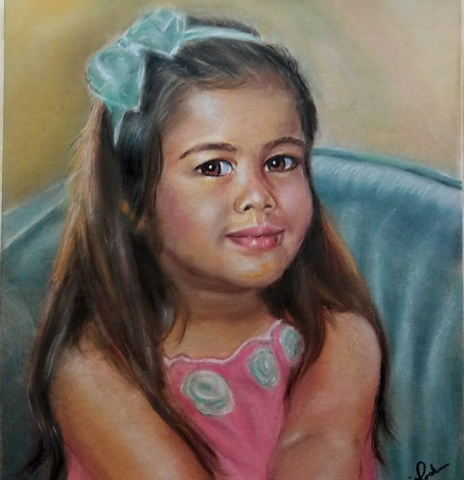
STEP 7 (FINAL)
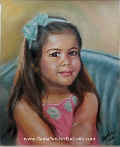
JULIET – Pastel on Sanded Paper 12″ x 16″
The final portrait of little Juliet. I signed it and sprayed it with a final coat of Spectrafix. Despite some hardships and problem-solving along the way (which is true of every piece), I really enjoyed working on this portrait. As much as I like drawing and painting animals, human portraiture is my first and truest love, and I always welcome the chance to do it!